
Responsive Web Design in Agartala: Why It’s More Important Than Ever for Local SMEs
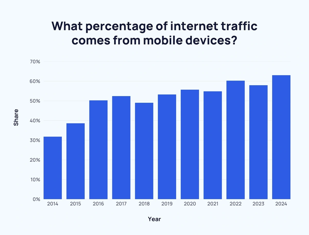
In today’s fast-paced digital world, your website is often the first interaction a potential customer has with your business. For small and medium-sized enterprises (SMEs) in Agartala and across Tripura, that first impression is increasingly happening on a smartphone. If a customer visits your site on their mobile device and has to pinch, zoom, and struggle to find information, they won’t hesitate to leave and go to a competitor. This is where responsive web design becomes a game-changer. It’s no longer just a technical feature; it’s a fundamental requirement for survival and growth in the local market. A responsive website automatically adapts its layout to fit any screen size, ensuring a seamless experience whether your customers are on a desktop, tablet, or mobile phone. This article explains why investing in responsive design is one of the smartest decisions any Agartala business can make today.
Common Problems Agartala Businesses Face with Non-Responsive Websites
1. High Bounce Rates and Lost Customers:
When a mobile user lands on a site that isn’t optimized for their screen, their immediate reaction is frustration. Text is too small, buttons are hard to click, and navigation is a nightmare. This poor user experience causes visitors to “bounce”—leave your site almost immediately—and go to a competitor.
2. Damaged Search Engine Rankings (SEO):
Google prioritizes websites that offer a great mobile experience through its “mobile-first” indexing. If your site is not responsive, Google sees this as a negative signal, pushing you down in search results for crucial local keywords like “web design Agartala,” making it significantly harder for local customers to find you online.
3. Negative Brand Perception:
A clunky, outdated mobile website reflects poorly on your brand. It suggests a lack of attention to detail and a failure to keep up with modern customer expectations, creating an impression of being unprofessional and untrustworthy.
4. Lower Conversion Rates:
The goal of a website is to convert visitors into customers. A non-responsive design makes crucial actions—like making a purchase, filling out a contact form, or calling your business—incredibly difficult on a mobile device, causing you to lose tangible business opportunities daily.
5. Poor User Experience (UX):
Beyond just aesthetics, a non-responsive site fundamentally fails to meet user intent on mobile devices. Customers today expect a seamless and intuitive experience across all platforms, and a site that requires constant pinching and zooming is a major deterrent.
6. Maintenance Inefficiency and Higher Costs:
Managing separate desktop and mobile versions of a website (an older alternative to responsive design) is inefficient and costly. A single responsive website simplifies updates, content management, and SEO efforts, saving you time and money in the long run.
Our Expertise: How Prabhabi Infocom Delivers Mobile-First Success
Custom SEO-Optimized Web Design:
We build visually appealing websites that are not just responsive but are fundamentally optimized for search engines from the ground up. By integrating target keywords like “web design Agartala” and “affordable web design and SEO services in Agartala” into the site’s structure, meta titles, and content, we ensure your business is discoverable by customers with high purchase intent. Our designs are clean, professional, and built to convert local traffic into measurable business growth.
Mobile-First Development Approach:
Recognizing that most of your customers will find you on a smartphone, we adopt a mobile-first development strategy. This means we design the user experience for the smallest screen first and then adapt it for larger devices like tablets and desktops. This approach guarantees a seamless, intuitive experience for all users, which is a critical factor in Google’s “mobile-first” indexing and helps reduce bounce rates dramatically.
Targeted Local SEO Strategies for Agartala & Tripura:
Pillar-Cluster Content Strategy for Topical Authority:
To establish your website as an authority in your field, we implement a powerful pillar-cluster SEO model. We create comprehensive “pillar” pages for your core services (e.g., Web Design, Digital Marketing) and support them with detailed “cluster” blog posts on related topics (e.g., Responsive Design, Local SEO). Each cluster post links back to its pillar, creating a tightly-knit content network that signals expertise to search engines and boosts your rankings for competitive keywords.
Focus on User Intent and Experience (UX):
Modern SEO success is built on understanding and satisfying deep user intent. Instead of just ranking for keywords, we focus on what your potential customer is truly looking for. We design clear navigation, ensure fast page load times, and structure content with clear headers and bullet points to make information easily accessible for both users and AI crawlers. This user-obsessed mindset not only improves rankings but also builds trust and increases conversion rates.
End-to-End Support and Business Analytics:
Our partnership doesn’t end when your website goes live. We provide end-to-end support and regular business analytics to give you a clear roadmap for expansion. We help you track key performance indicators (KPIs) like website traffic, lead conversions, and call analytics to measure the return on your investment and continuously refine your digital strategy for sustained growth.
A Case Study: Boosting a Local Retailer’s Sales with Responsive Design
A well-known retail store in Agartala approached us with a common problem. They had a website, but their online sales were stagnant, and analytics showed a massive drop-off in traffic from mobile users. Their site was not responsive, and the mobile experience was driving customers away.
Fluid Grid and Flexible Images:
Optimized Navigation:
We implemented a clean, touch-friendly mobile menu (often called a “hamburger” menu) that made it effortless for users to navigate the site on a small screen.
Faster Load Times:
We optimized images and streamlined code to ensure the new site loaded quickly on mobile networks, which is crucial for retaining impatient users.
Prominent Call-to-Actions (CTAs):
We made sure key buttons like “Add to Cart,” “Contact Us,” and the store’s phone number were large, accessible, and always visible, simplifying the conversion process.